PowerPoint Tips and Tricks
Microsoft Office, PowerPoint
…or, Some Ideas for Good PowerPoint Presentations
There are people who believe the joke that says, “We have met the enemy, and he is PowerPoint.” I don’t think so. But it is true that some people, through no fault of their own, don’t know where to start when it comes to creating a good PP presentation. And there are some things anyone can do to create a decent one.
GENERAL IDEAS
According to some, an officer in the USMC can brief a dozen subjects in under an hour. While not everyone is quite so succinct, it is a step in the right direction. Keeping the presentation simple and to the point is good. Less is more.
Not everyone in the audience may know the subject matter. Check on this if possible, and plan accordingly.
Format for readability, and for emphasis as needed. (If a company has product branding standards, they should be strongly evident.)
Keep to three or four bullet points per slide, max. More than that is like taking larger bites of food—one can choke. (Mentally, it’s similar to the Gary Larson cartoon wherein the student says, “Mr. Osborne, may I be excused? My brain is full.”) More slides with less content per is better than the opposite—a little at a time.
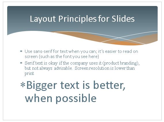
Make the text big enough to read easily. One of my former colleagues was a Naval aviator and had 20-20 perfect fighter pilot eyes. Not everyone does.
Use sans-serif fonts, like Arial, Helvetica, or Optima if possible—the less complicated letter shapes are easier to read on a monitor or projector screen. And stick to one or two fonts at most. Much less cluttered-looking.
Stick with as few colors as possible, too. Again, less busy-looking—and it won’t look as if the circus came to town. (That product branding thing can be helpful here.)
GRAPHICS, AUDIO, CHARTS
Graphics and audio can take up a lot of room on disk, and time to download. So use them sparingly in PowerPoint, like seasoning on a meal.
(Audio can be a megabyte per minute if it’s good quality. DVD-level video can be four megs per second.)
Charts are useful, but they too need to be simple—if there’s a lot of information, create more charts. And make sure you label everything—simply.
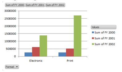
This is a pretty good chart.
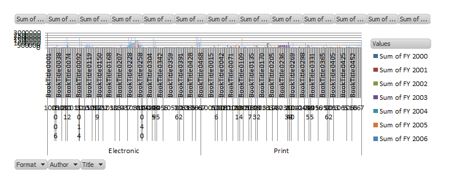
This isn’t. 😉
Pick the right kind of PowerPoint chart for the data. There are pie charts for percentages, column or bar charts for sales figures, line charts for trends, etc. Trying a few different kinds is okay if you want to, but knowing what works for what most of the time gives you a foundation to work from.
Other elements in a chart can help, too. The company logo should be in any company presentation.

Photographs of people involved are also a good idea. (If you need a picture of someone outside the company, find out if you need a release form. Better to find out the easy way.)

TRANSITIONS AND ANIMATIONS
Be careful not to overdo these, either. If you go overboard here, the presentation can end up having the feeling of a Looney Toons cartoon. And that’s usually not desirable, even if the audience has a sense of humor, because it’s a distraction. But just one or two transitions, alternating, or a few variations on just one, and similar animations throughout, will be more consistent, yet not boring.
And transitions should be “medium” or “fairly fast” speed—one to three seconds, so the audience can see the change but not be held in suspense (again, not really professional). This also gives the presenter time to verbally segue from one to another.
There are a few more points that figure into good PowerPoint work, but these are pretty sturdy, and after hearing this sort of stuff bounced around in class for twenty-plus years, I think my students have the fundamentals solidly by now.
For more information, take a look at our PowerPoint training classes.