Using the Baseline Grid with InDesign
Adobe, InDesign
One of the more subtle things we can do with an InDesign document to make it look more professional—i.e. polished, consistent, easier to read—is to use the Baseline Grid. This relates to how the text lays out and vertically lines up on the pages of the document.
The main requirement is that the text be reasonably consistent in terms of size and font from page to page; this is normal in most professional documents, so not hard to achieve.
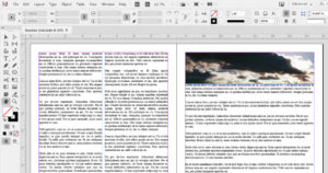
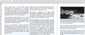
Once the text and the text boxes are ready in size, position, and so on, the baseline grid feature can be set up in the Preferences (in different places for Windows and Mac, but the same dialog once there). The default color is light blue, probably because lined three-hole-binder paper uses the same color for various reasons. The Relative To option usually works better when set to go from the top margin. Most conventional business documents don’t have text outside the margins. And the Increment Every measurement should be the same as the leading (or line-spacing) of the body text. (Which, hopefully, is mostly the same font and size throughout the document.) The whole idea, you see, is to have the text march down the page in nice, evenly-spaced lines, on both sides of a two-page spread.
Once you show the feature (via the View–>Grids and Guides submenu), View Threshold also matters, as one would not want this feature showing (and crowding the screen) if the text is too small to read. 100% is a good number, so the baseline grid won’t show unless the page is life-size or larger on screen.
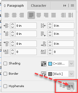
The other part which needs doing is that the text object has to “know” to use the baseline grid. Click in the text box with the Type tool, as we’re working with the text in there, NOT the container, select (usually) all the text in the story, and (the simplest method) bring up the Paragraph panel. Bottom right corner, the very last button will Align to Baseline Grid. That’s it.
Can we automate this? Can some of this happen in advance or by style? Certainly. Regardless, the Baseline Grid is fairly easy to use. It gives an almost inconspicuous, yet powerful, boost to the readability of the document. It’s a real under-the-hood feature that still kicks like a turbocharger.
To learn more, check out our InDesign training.


