RGB vs CMYK–Which should I use?
Adobe, Photoshop, Web Design
Having taught and worked with Adobe Photoshop for many years, I get asked many basic but good questions about it by new users. One has to do with color, and the color systems we use in a picture. There are several that Photoshop can use, but the two most common are RGB and CMYK. The question: Which is best?
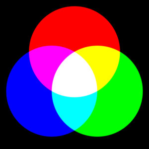
The fundamental difference between the two is, RGB is meant for use on screen, and CMYK for print. The terms used to describe how they work are “additive primaries” and “subtractive primaries”, which refer to how these systems show white. For RGB, imagine standing in a dark room with a white wall. Take three flashlights, with color filters (red, green, and blue) and shine them on the wall. Where the three colors overlap, they seem to make white light (the opposite of what a prism does with white light—see Pink Floyd’s album THE DARK SIDE OF THE MOON, specifically the cover—and the back cover.) So the three additive primaries add up to white.
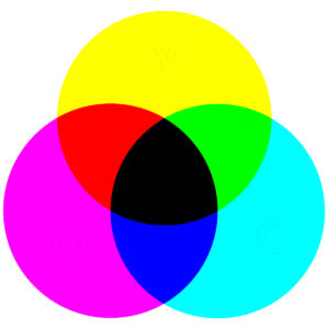
With CMYK, the example is even simpler—a piece of paper going through a color printer may have areas where no ink or toner has landed. And the color of the paper we usually use? White, of course. So when the colors are held back, or subtracted, from a spot on the paper, that spot stays (or is) white.
But we need black ink too, because the dyes or pigments only sorta make black, and a normal eye can see this. So the printing folks added it for completeness.
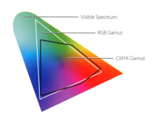
In doing this, though, we get a couple of problems, and it takes a little thought to get round them. First, the RGB system normally involves a screen that illuminates itself. So it can show more subtle shadings of color than a piece of printed paper (which, unless you’re using radioactive inks—shame on you!—does NOT glow in the dark). The term Photoshoppers and graphic artists use is the “gamut”. Which is wider/larger for RGB vs CMYK (where the ink/toner can smear, and mess up the shadings). And a printout can’t show all the shades that a screen can. By definition, therefore, printout will always look a little less intense (“saturated”) than onscreen images.
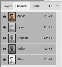
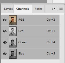
Second: Any Photoshop image saved in CMYK will use 33% more space on disk, regardless, than with RGB. Why? Because the number of color “channels”, how many kinds of color there are in the picture at minimum, is three for RGB, and four with CMYK.
So which should we use?
If you’re scanning in a photograph you want to clean up and reprint (say, from the early 1900s), CMYK will work better. What you’ll see on screen is what will come out of the printer. But if you’re scanning for archival purposes, scan in CMYK if possible to get a realistic version of the image. THEN change to RGB. RGB’s gamut is wider than CMYK’s. So you won’t lose any subtleties or shadings, but you will get a smaller file on disk. And you can scan in CMYK, do all your work, then save in RGB for later. Best of both worlds. Just have to make sure we understand the RGB vs CMYK tradeoff of size, gamut, and storability.
Be sure to check out our Photoshop classes.
