Using a CSS Reset
CSS, HTML5, Web Design
One of the frustrations designers have been feeling for some time now stems from web design by committee, or design via theme. Many web sites today are WordPress sites with a theme and some content. Just add words and you have an instant site. Then comes the task of modifying the site and trying to make heads or tails of the built-in CSS. Have fun! And we won’t talk about accidently removing content that hoses the database that breaks the site…Arg! But I digress. Sometimes that frustration can come from the browser itself. Did you know that your browser, user-agent, has its own stylesheet and it is first in line to style everything until you step in?
CSS reset to the rescue.
At least that is the way many people feel. Let me, the designer, decide what things should look like and you, the browser, step aside so I can do my job.
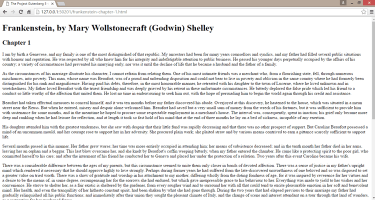
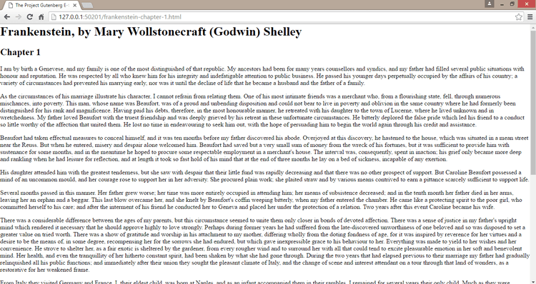
To demonstrate we will be using the first chapter of Mary Shelly’s Frankenstein and three different interpretations of a CSS reset. Here is what the page looks like as rendered by Google Chrome and its stylesheet.
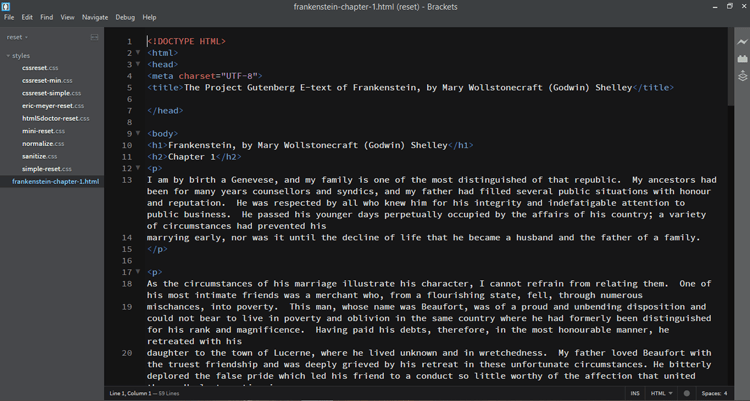
The HTML is simple and straightforward. A couple of headings and a series of paragraphs. Everything about the page, font, text color, background color, line height, heading size and weight are all set by the browser stylesheet.
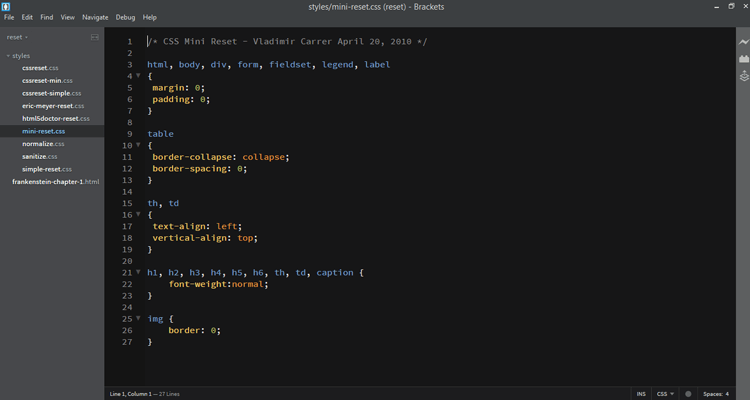
The first reset we will use was designed by Vladimir Carrer back in 2010 and is a minimal approach to resetting the user-agent styles. It contains 5 declarations and modifies 18 elements, barely. Two of the declarations deal with tables and we aren’t using any tables.
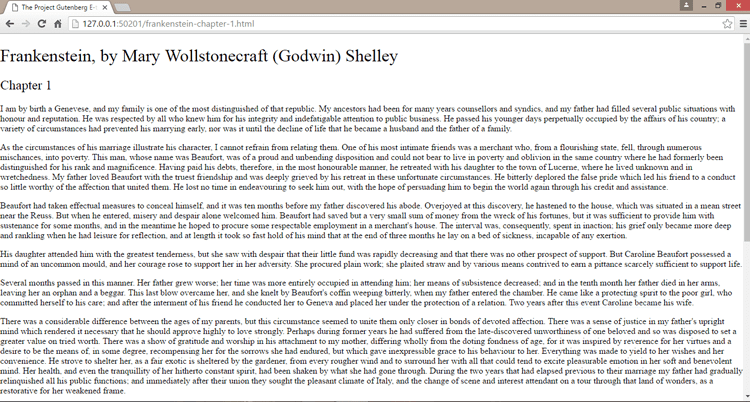
The end result looks like this:
The primary things you will notice include the weight of the two headings has been returned to normal and the document margins and padding are set to zero. So little change it’s almost not noticeable. “I wanted to make Mini CSS Reset who will focus on the main CSS features like Divs , Tables and Forms who are also the most used CSS(HTML) elements.” – Vladimir Carrer
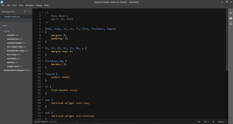
The next reset was created by Russ Weakly back in 2010. It is a little more involved but still changes little within our document.
The end result looks like this:
The largest benefit to our document using this stylesheet is the elimination of margins from the top of headings and paragraphs. In essence what is left is “space-below” which makes it easier to control these elements.
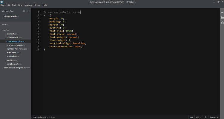
The last reset we will investigate today is the shortest but involves the largest changes. It is mentioned in Jason Cranford Teague’s book CSS3. The premise is to reset the most important styles using the universal selector. It changes 10 properties on everything.
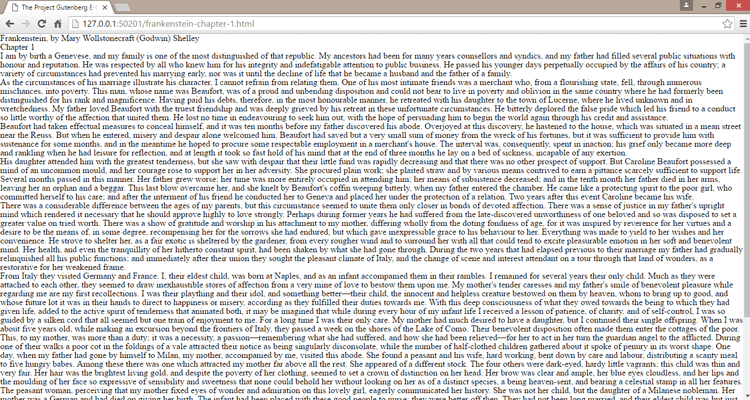
The end result looks like this:
It almost resembles a document with no tags, therefore, no styles. The thing to keep in mind here are the 10 properties that have been altered and what we want those new settings to be. A reset returns design control to our hands and that is generally what a designer wants.
This reset works well for small to mid-sized sites but can create a lot of work for large sites.
