Using Slide Master View in PowerPoint
Microsoft Office, PowerPoint
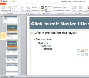
One of the few parts of PowerPoint that isn’t quite intuitive is the Slide Master view. Getting to it is easy–go to the View tab–>Master Views group, and click Slide Master.
Then it gets a little more complicated.
To some people it looks as if they never left the Normal view–all that stuff over on the left side looks kinda like their slide show, but it isn’t. So what is it?
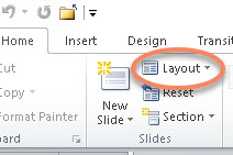
Those are the slide layouts you see in the Home tab–>Slides group–>Layout dropdown. In other words, those are the basic layouts you can use to create or give structure to any slides in your show. They’re built-in and always available.
Okay, first question answered. Then what?
Can we change them, or add to them? Sure. Usually the best thing to do is right-click and duplicate one whose setup is close to what you want, and modify the duplicate. Saves time and work. The same right-click gives you the ability to rename or delete one, so there’s your freedom of fiddling.
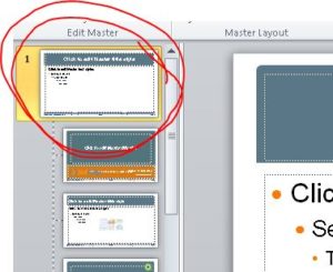
Wait a sec, though…what about the bigger slide at the top, the one all the others are connected to by the dotted line? Well, that’s the actual Slide Master, the Big Kahuna, le Grand Fromage (sorry, it slipped in).
And what does he do? His job is to control the appearance of the others. More specifically, the background elements (graphics, company logos, etc.) and the text appearance (fonts, sizes, colors, and so on). NOT the layout of the stuff you put on the slides.
So if you want all your slides to have a consistent appearance (highly desirable in almost all shows, business or other), do the basic visual stuff in the big boy at the top, then create or modify the smaller ones for the way you want the layout of the elements in the slides. And best to do it before inserting content, if you can. Less work on the back end. (Build the foundation before you build the house.)
What about other slide masters and layouts? Can we have more than one set in a slide show? We can. Whether it’s a good idea is another matter–usually one doesn’t want to mix too many slide masters/color schemes/etc. in one show unless they’re variations on one master theme, because it shouldn’t look like a circus came to town. But the program will allow it. So be conservative about such things. Still, don’t let it stop you from experimenting.
For more info, check out our PowerPoint training.


