Styling the Humble Checkbox Using CSS
CSS, HTML5, Web Design
The checkbox has been a staple in the world of HTML forms since day one and for the most part has remained unchanged. HTML 4 introduced the label tag which can be associated with a checkbox using an id attribute in the checkbox and the for attribute within the label. That way you don’t have to click directly on the checkbox, simply clicking the label will select or deselect it.
If the checkbox looks any different today compared to 20+ years ago it’s only because the browser renders it that way.
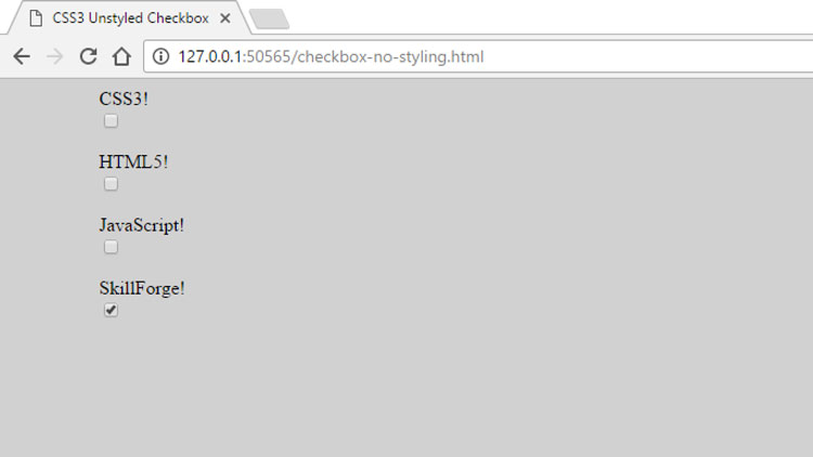
A typical form with several checkboxes would look like this:
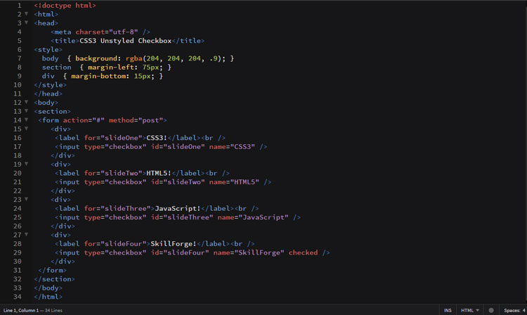
And the code to generate the page looks like this:
Four simple checkboxes with labels. Nothing fancy but they could be simply by applying a little style using CSS.
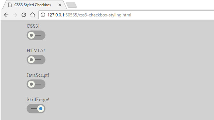
Take a look at the same four checkboxes after a CSS makeover:
The HTML to generate the page has changed a little, but not all that much:
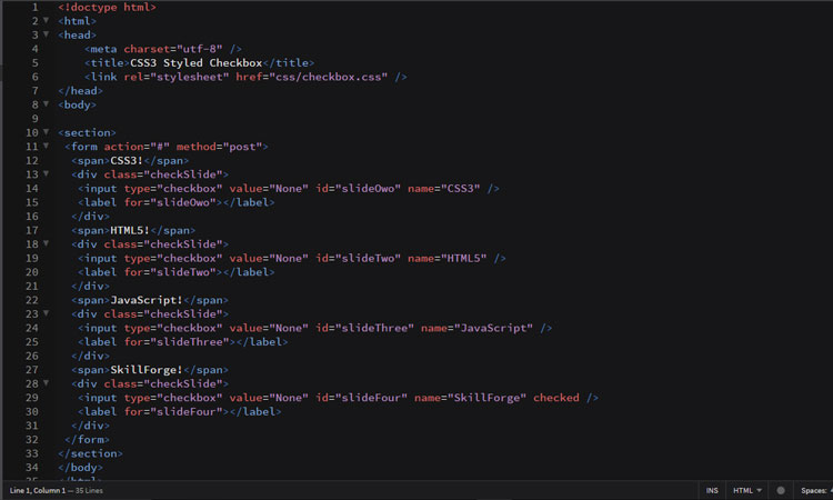
You’ll notice the label is still there but it has been emptied and moved after the input tag. We’re using it to create the circles and it is an easy task because the id associates the label with the checkbox. In place of the standard label we’re using a span tag to tell us what the checkbox represents.
All the heavy lifting is being done by an external stylesheet using one class selector, one element selector, and a few attribute selectors.
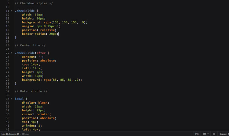
First up we shape the div tag that contains each checkbox. We size it, color it, round off the corners, and position it. The relative positioning is necessary because items within it will be absolutely positioned and need a point of reference.
Next up we create the narrow gray line the circles move along. It’s nothing more than empty content that has been sized, absolutely positioned, and colored.
Now we can start working on the circles, both outer and inner, and we will use our empty labels to accomplish this. They will be positioned, sized, stacked and shaped. Oh yeah, and one last item, a CSS3 transition that will allow the circles to shift when they are clicked.
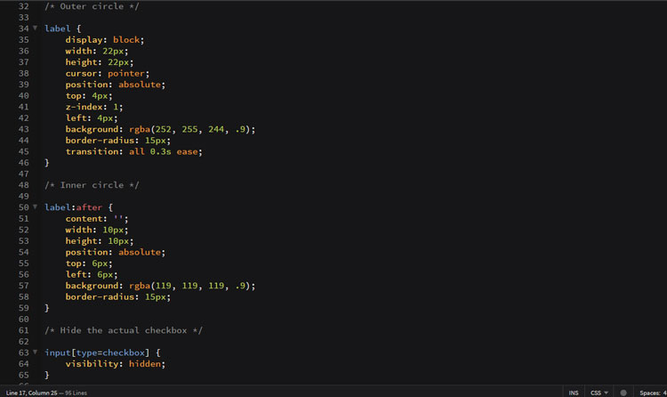
The :after pseudo class will be the vehicle used to create the inner circle.
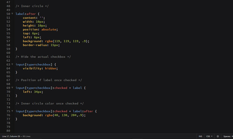
The last three selectors are all attribute selectors aimed at the [type=checkbox]. The first one hides the regular checkbox. The second one moves the label (our circles) 34 pixels from its current position when the checkbox is clicked. The last selector changes the inner circle color when clicked.
A pretty amazing change and all done with a little CSS slight-of-hand.