Use Type on a Path in Adobe Illustrator
Adobe, Illustrator
The use of type on a path is an interesting cross between text and graphics, and allows text to be more than just a means of conveying information in Illustrator. But in order to use the feature correctly, one has to understand a couple of things about how it behaves.
First, we usually need to create the shape which we’ll use as a baseline, in the sense that typography uses the term—the line on which the text sits.
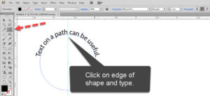
Then, we select the Type on a Path tool (in the same flyout as the regular Type tool). Position the cursor on the edge of the shape. When the “squiggle” that marks the hotspot of the cursor is on the line, we can click and type.
Once we click, we can also do most of the basic things we expect with text. We can change font, size, color, alignment, and so on.
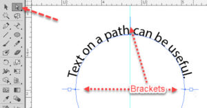
There are a couple of controls we need to know about, as well. They’re called brackets, and they control where the text is on the path. The two outer ones are the bounds of where the text can be; we can adjust them to show or hide the ends of the text. The middle one lets you slide the text along the path, left or right, till it gets where you want it. We usually use the Direct Selection tool to work with them. Grab carefully—watch for the cursor change to tell you when your cursor is on the control.
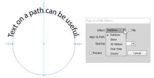
We can also go to the Type menu > Type On A Path > Type On A Path Options command, and change how the text sits on the path. These are interesting, and can add a little pizzazz to text if you need it.
Dragging the bracket to the opposite side of the path will indeed flip the text “over”, another potentially useful trick.
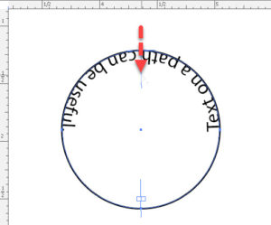
One peculiarity, though. Sometimes, when we first click the path (especially if it’s closed), the insertion point can appear halfway round from where we click. So we drag the center bracket round to where we want the type on a path. (After all this time, I still don’t know why this is the case, but better to be aware.)
Many people tell me they find using guidelines helpful when precision placement of text is important. Dragging the path object to the right size, placing it carefully, and remembering it loses color when we add the text (we can click with the Direct Selection tool later to add it in again) are all things one should practice when working with type on a path.
To get more out of this program, take a look at our Adobe Illustrator training.


