Using CSS3 Instead of JavaScript
CSS, HTML5, Web Design
CSS3 has been in development since 1998, that’s right, 1998. Both CSS1 and CSS2 became standards in quick succession, December of 1996 for CSS1, and May of 1998 for CSS2. One of the main differences between CSS3 and its predecessors is the use of documents or “modules” to contain different components of the specification. Some examples would include media queries, level 3 selectors, level 3 color, and multi-column layout. These modules progress at different rates and are largely dependent on browser support.
There are two specific modules we are going to take a look at today: transforms and transitions.
Transforms can be 2D or 3D and allow you to scale, rotate, move, or skew an object.
Transitions allow you to change properties smoothly from one value to another, over a measured duration.
These two modules in combination allow us to perform basic hover effects that in the past were only doable using JavaScript. The advantage of using CSS is twofold: less code, and slightly better performance since animating a transform occurs in the GPU.
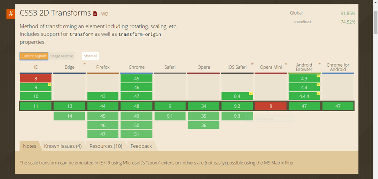
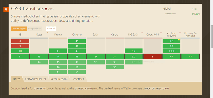
If you are concerned about browser support we have included screen captures from caniuse.com. All is well as long as your users/clients have progressed beyond IE9.
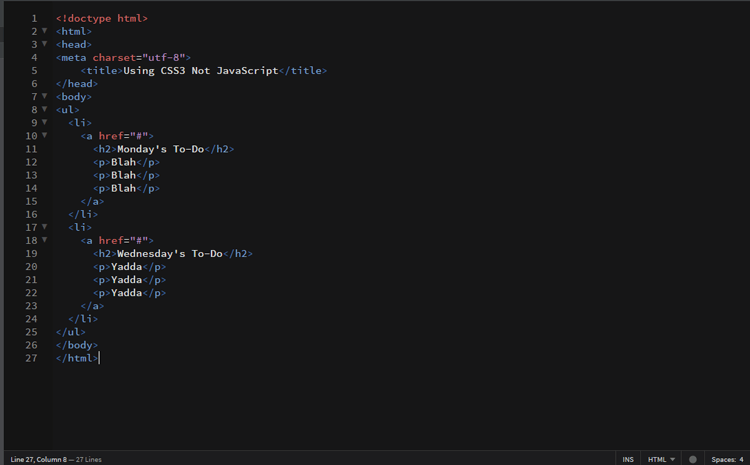
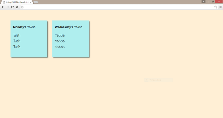
Our demonstration will begin with a simple list that will be styled to look like a couple of sticky notes.
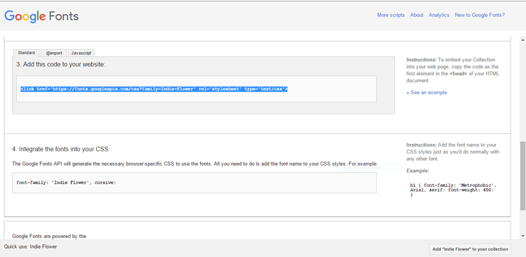
To make our sticky notes appear to be hand written we would like to use a font that looks that way, hand written. CSS3 makes that easier now because of the addition of web-fonts. For years we were stuck using the same fonts over and over again. Now it’s as easy as going to Google Fonts, selecting something from their list of over 700 fonts, clicking the quick use button, copying a link and pasting it into the head of your web page. Just use the name of the font supplied by Google in your stylesheet and you are good to go.
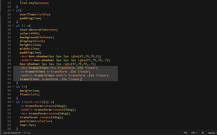
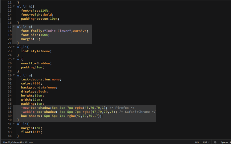
We’ll also add a drop shadow to give a sense of dimension to our notes. You’ll notice a prefix being used for this code. With 5 browsers vying for your attention and each of them progressing at a different pace they have taken to using slightly different syntax. This prefix is necessary for a given browser in order for your style to work. Eventually all browsers will use a standardized syntax, but for the time being we will include the prefix to guarantee success.
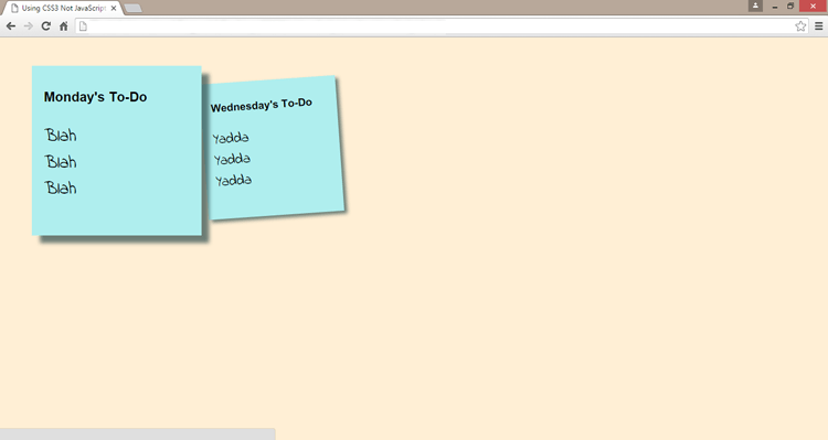
With some basic styles in place our page should look like this.
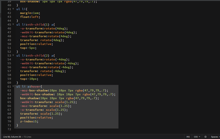
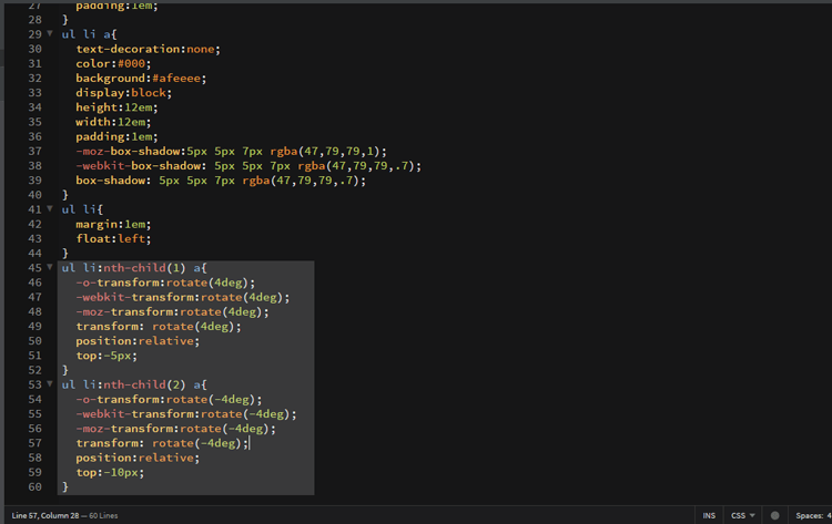
Now we want our sticky notes to appear randomly placed which means they shouldn’t look straight or level. That’s where transform comes into play. We’ll take each note and rotate it and use relative positioning from CSS2 to move them up or down. We are also using the CSS3 pseudo class nth-child to select which list item we are styling.
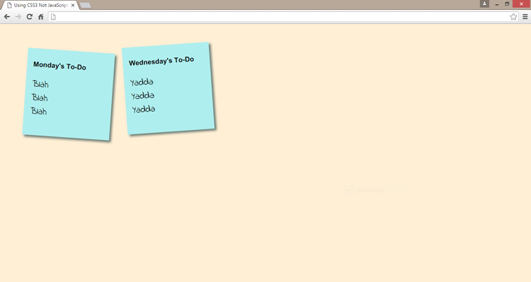
Our page now looks like this.
The over-all effect we are looking for is a zoomed in, straightened view of our sticky note. To accomplish this we will use the CSS2 pseudo-class hover. It will allow us to scale our note using transform and then time and smooth that transformation using transition.