How to Clean Up Reports in Microsoft Access
Microsoft Access, Microsoft Office
There are a few important and helpful things to watch out for in Access reports. They spring from the fact that, unlike most other database components, reports often have to stand on their own. So their formatting and layout have to be more complete and user-friendly up front.

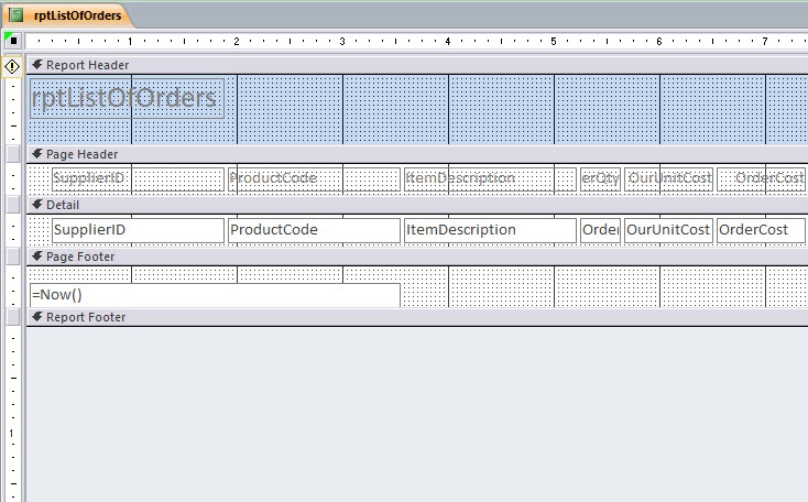
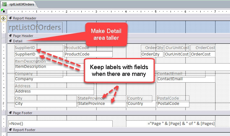
One thing to keep an eye on is the layout of field labels. If the report includes relatively few fields, the labels can often go in the page header, one per column. But if the report has more than six or eight fields, labels might go better right above or next to each field, for clarity.

And if there are that many fields, the next thing to do could be to make the Detail space taller, and have more than one row of fields (text boxes) to display data, with the labels positioned as I mentioned just now.

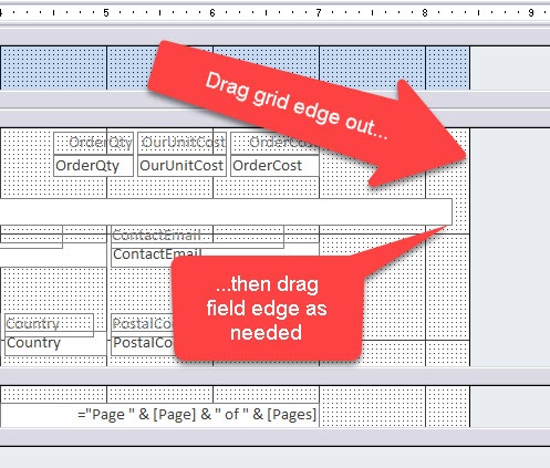
Another more subtle point has to do with the grid, in which all the report info is sitting regardless. And even some experienced users aren’t aware of this. The grid itself can be manipulated; its width, for example, can affect the printing characteristics of the report. If the grid is at or greater than the width of the paper on which you’re printing, it can force a second “column” of pieces of paper in the printout, without having much on them. And this can of course be wasteful. Luckily, the solution is simple. Grab the right edge of the grid, and drag it to the left. When its width is at least a half inch or so less than the paper’s, you should be okay.

If a field is too wide, and its edge hangs “under” the edge of the grid, simply drag the grid to the right, adjust the width of the field, and get the grid edge back where it needs to be. This is not an uncommon issue when doing the initial layout.
For more info, check out our Microsoft Access training.