Adobe InDesign Text Layout Tips
Adobe, InDesign
Having done desktop publishing since 1985, albeit as an amateur, I’ve learned a few tricks which seem to help with things like layout. And the ability to control layout has come a long way since I started.
One is to understand that the appearance of the type can have an influence on the readability. Using sans-serif fonts, such as Helvetica or Arial, is better for online or screen documents. Whereas serif fonts like Times New Roman or New Century Schoolbook works better for print. The serifs act as guidelines, much like those on a ruled piece of paper, to speed the eye along the text.
Another is the use of leading (pronounced like the name of the element or the rock group, not the idea of “lead versus follow”); for some reason, some people seem to think that minimizing the leading, or vertical distance between lines of type, to pack more text onto a page, is a good idea. As Wolverine says in the film LOGAN, “Not okay!” It becomes almost unreadable, as the eye can’t find the beginning of the next line. Many fonts now have auto-leading ratios built in. These work reasonably well in the absence of any more specialized software or criteria.
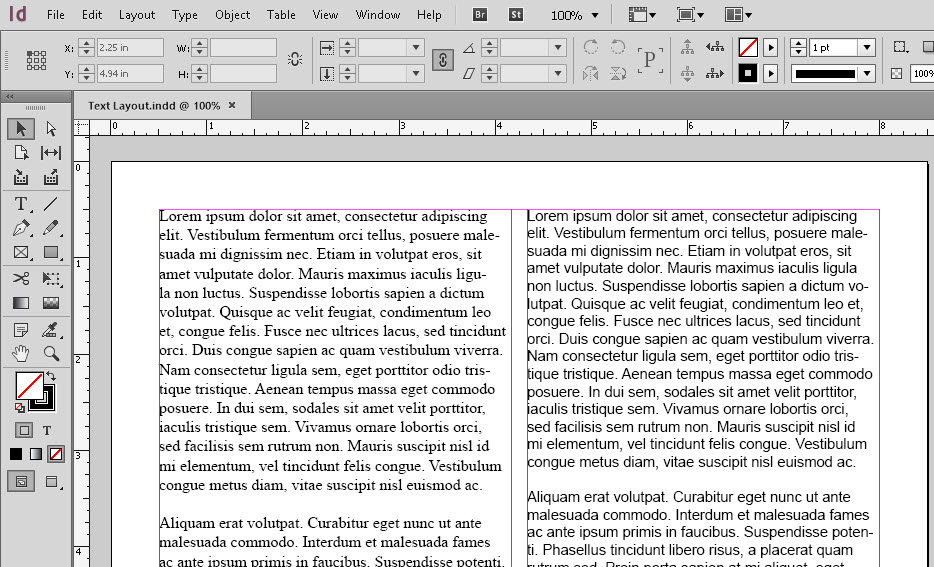
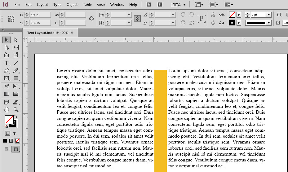
There’s one thing we can adjust fairly easily in many DTP programs (I use Adobe InDesign here as an example). That’s the gutter space between columns of text. It’s another of those pack-as-much-text-as-possible-on-the-page things which, again, is wrong. I’ve heard various guidelines for ratios of gutter to font size, but there’s one broad rule of thumb. Regardless of font, font size, or proportion of letters, about five to seven words per line in a column if possible. Otherwise the writing looks rather like the visual equivalent of a song played from a scratched CD or a staticky radio broadcast…a few words, pause, words, pause, and so on.
That kind of stop-and-start visual seems like trying to speak with hiccups. It can actually be irritating to someone trying to read it. (If it sounds like I’ve run into this as an occasional proofreader and writer, you’re right.) But at least InDesign makes these adjustments fairly easy.
Are there actual rules or formulas for all this? Several. The specifics are easy to locate, but these bits here should provide a good start.
To get a handle on this, try our Adobe InDesign classes.