Using the Baseline Grid with InDesign

One of the more subtle things we can do with an InDesign document to make it look more professional—i.e. polished, consistent, easier to read—is to use the Baseline Grid. This relates to how the text lays out and vertically lines up on the pages of …
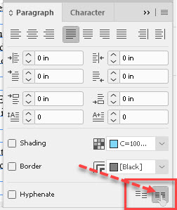
Read More

Kerning and Tracking Adjustments in InDesign

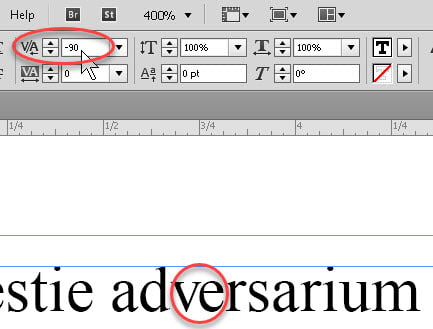
A while back, I posted an item about text layout in InDesign. There’s another aspect of it I wanted to mention which might be of some further interest, namely kerning. This is usually the fitting-closer-together of pairs of letters whose shapes make it aesthetically possible …

Read More

Adobe InDesign Text Layout Tips

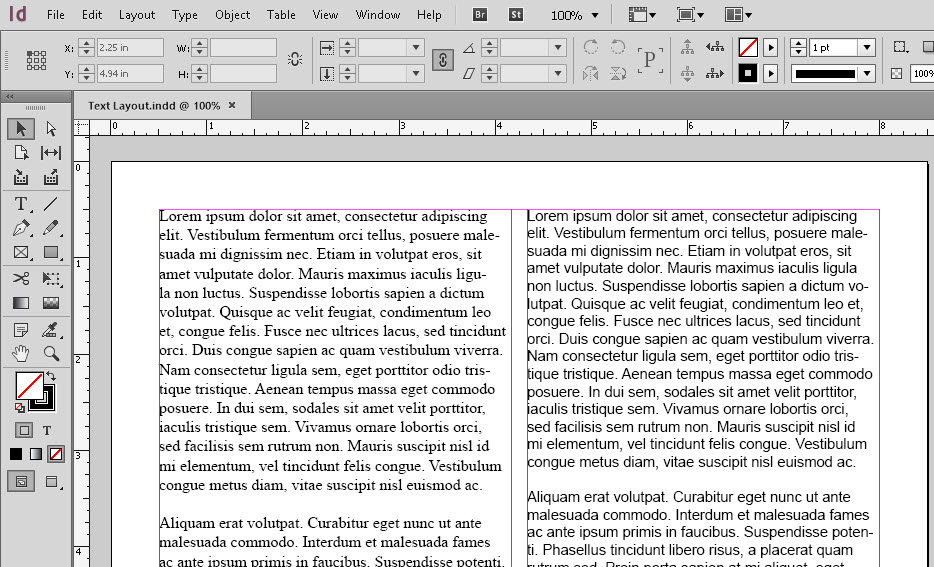
Having done desktop publishing since 1985, albeit as an amateur, I’ve learned a few tricks which seem to help with things like layout. And the ability to control layout has come a long way since I started. One is to understand that the appearance of …

Read More