How to Size Fonts in CSS
Adobe, Dreamweaver, Web Design
One consideration most designers go through when creating content for today’s web is; should my stylesheet begin with a reset? The variety of reset options used today is fodder for a completely different discussion, but there is a subtopic I’d like to pursue.
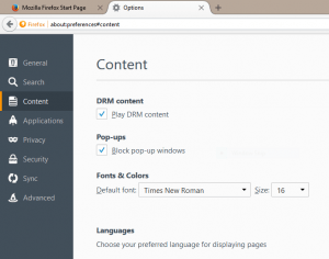
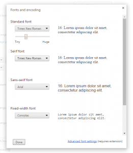
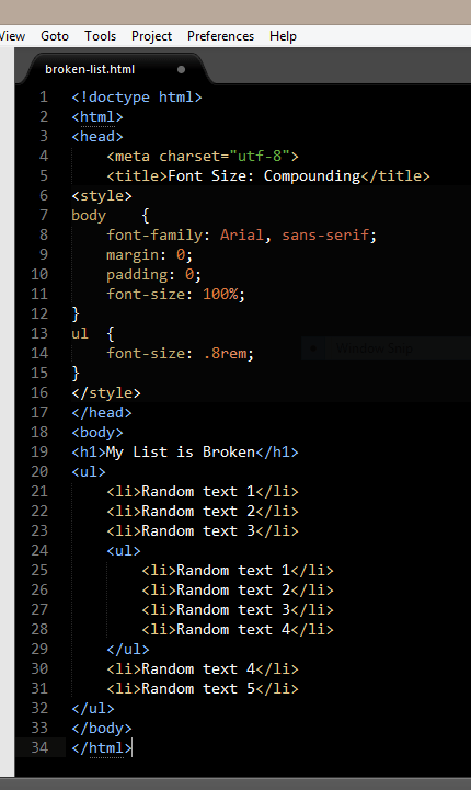
Oftentimes a stylesheet will begin with a few very basic reset options. Simple things like setting the margins and padding in the body of the document to 0 (zero). Another is establishing the font to be used throughout the document as well as its size. The user agent (designer speak for the browser) sets the size of the font to medium, which translates to 16 pixels.
The easiest way to establish this default font size setting is to set it to normal, or 100%. Most of the popular reset stylesheets do just exactly that, set the font-size to 100%.
That works well, but we might run into some issues if we decide we want to use ems as our unit of measure.
CSS offers 15 different units of measure: cm, mm, in, px, pt, pc (all absolute), em, ex, ch, rem, vw, vh, vmin, vmax and % (all relative).The absolute units of measure work well for output other than the screen, such as print. Ems work well for the screen because of their scalability. That is, until we start nesting items, such as lists.
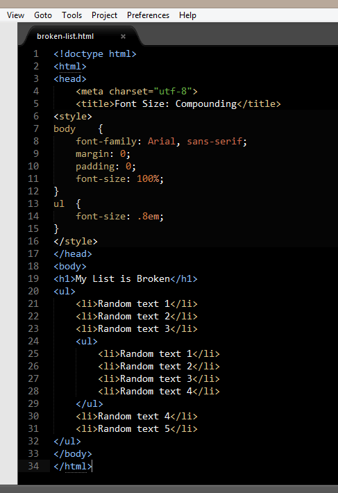
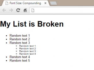
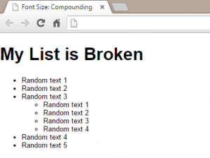
If the font for a list is set to .8em and there happens to be nested data, the nested list uses inheritance to establish its size. That size, in our example, will be 80% of its parent. So every nested list would be 80% of the previous container. The incredible shrinking list is not exactly what we want.
The solution to this dilemma is to use .8rem instead. Rem as a unit of measure refers to the root element, not the parent. So each list, no matter how deeply it is nested, would be 80% of the normal font size.
This is one of those early lessons learned when you start using something other than pixels for sizing in your CSS files.
