How to (Better) Convert to Grayscale in Photoshop
Adobe, Photoshop
When we convert a color image to grayscale in Photoshop, we obviously toss out color. But sometimes this makes the image look a little flat. Color can make an image look vivid, and not just because color is there. It also allows subtle contrasts, enhancements, and other things which are harder in a grayscale image.
But grayscale images can be enhanced, and there are one or two tricks we can pull before the actual conversion.

One is based on the color or colors which form the majority of the image. We can use a Color Balance adjustment layer to make colors stand out, or mute them. Essentially this lightens or darkens large parts of the image, and increases contrast. And it can be applied to Highlights, Midtones, or Shadows, so we can tweak the main brightnesses fairly precisely.
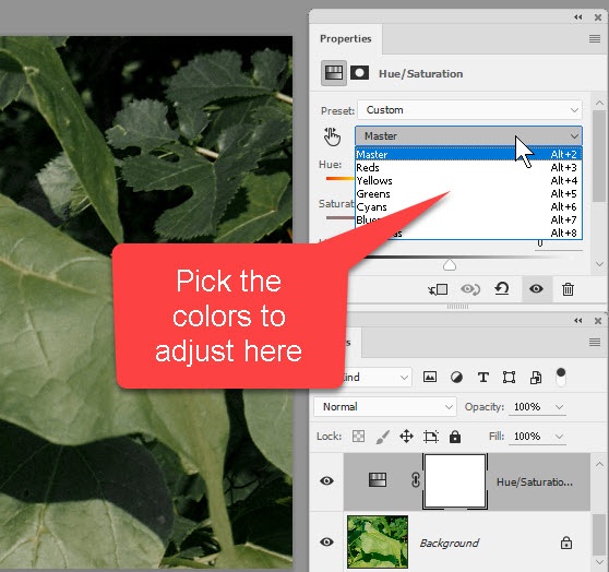
Another technique is to use a Hue/Saturation layer to adjust the lightness of the individual colors within the image. In some cases, we can dial the most dominant color down in the Lightness slider, to increase contrast a little. And we can adjust the adjacent colors (say, cyans and yellows, either side of green) to improve it further.
If it sounds like I’m going on about contrast, I am. That and brightness are the essentials in grayscale images, and once we convert, those are mostly what we can adjust.
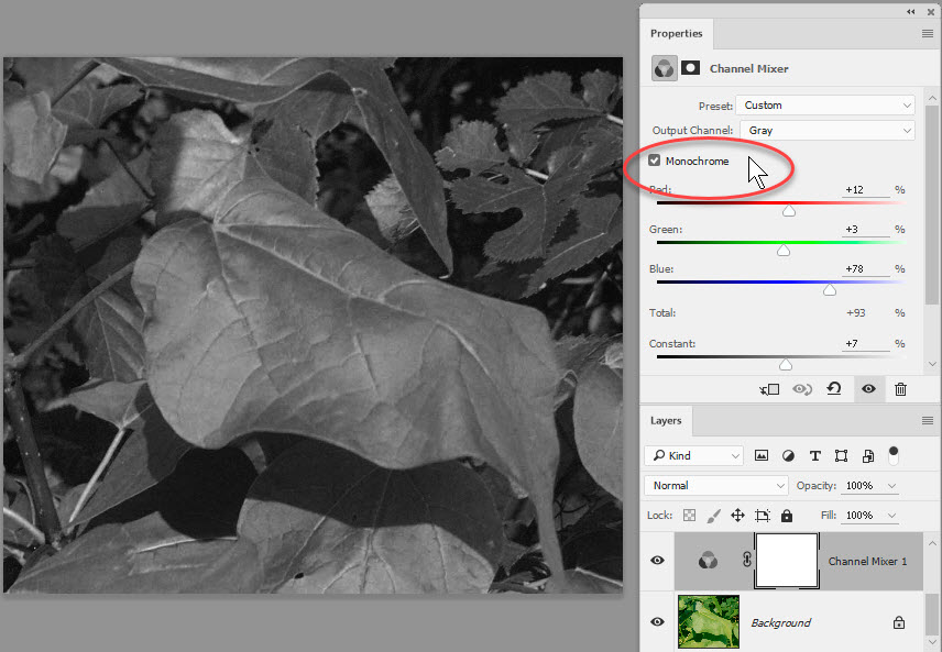
For something a little more subtle, you can try a Channel Mixer layer and check the box for Monochrome. Then you can work the RGB sliders, along with the Constant (essentially lightness) till you get a result you like. This trick has another advantage—it kind of “pre-converts” the image to grayscale. So if you can use this one last, and get a good overall result, the actual conversion won’t change the appearance of it one bit.
And you’re right, I’m not being specific about numbers here for the slider adjustments. That’ll depend on the image. And yes, these can be combined—one of the nice things about adjustment layers.
You might have also noticed I’m only talking about adjustment layers, and no selection-based stuff. Not that there aren’t other ways to fine-tune, but I wanted to get a few quick-and-simple things in, too. The adjustment layers, by definition, are adjustable. So you can play around with the numbers all you like.
The actual conversion, once this is all done, is very straightforward. (Don’t forget to save the new version as a copy, so you have a backup.) Image->Mode->Grayscale—usually we’re sure about tossing color out—and that’s it.
For more on this and other graphics training, take a look at our Adobe Photoshop training here.