How to Select Precise Colors with Pickers and Libraries
Adobe, Illustrator, Microsoft Office, Photoshop, PowerPoint
More than ever in today’s business world, having one’s company stand out from the competition is important; product branding, and the use of color in particular, is integral to this.
Product branding is the term we normally use to describe a distinctive scheme of hue/shade/etc. choices, font choices, logo, etc. which give a company a unique “look”. Coca-Cola, John Deere, Five Guys (a burger chain), Panera—any company at all. So how can a company select—and use consistently—any of these, particularly color?
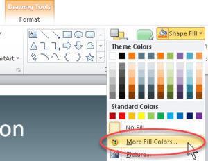
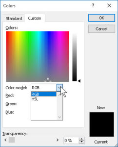
There are at least two methods we can use, at least in a majority of programs. One, which is pretty universal in business software, is the so-called “color picker” in its various forms. In PowerPoint, one can create or select a shape, go to the Home tab in the Ribbon, and on the right side click the Shape Fill dropdown. From there, one can click the More Colors option, and in the Custom section, enter the numbers which represent the RGB (Red-Green-Blue) or HSL (Hue-Saturation-Lightness) values for a company color. We don’t see the other main system, CMYK (Cyan-Magenta-Yellow-Black), as we print hard copy from PowerPoint slides comparatively rarely. But most companies can give someone CMYK values which can convert to RGB without too much trouble.
In other programs, such as Photoshop or Illustrator, we can indeed enter CMYK values directly; since these are often what businesses use for print ads, they work fine.
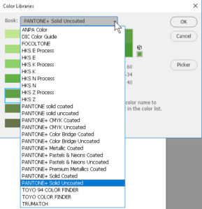
But we can go further; we can also use one of the many libraries available, such as Pantone, Toyo, Trumatch, Focoltone, ANPA Color, and others. These are recognized color standards worldwide. They guarantee that printed material will be as accurate to particular colors as possible.
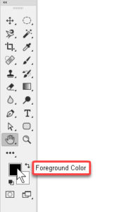
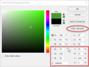
Getting to the Color Picker in, say, Photoshop or Illustrator, is as simple as clicking the foreground or background color swatch. Once the dialog box is up, one can enter HSB (Hue-Saturation-Brightness), RGB, CMYK, or even Lab (a system in existence since 1931) numbers. And to get to the color libraries, simply clicking the button of that name on the right side of the picker will jump to them. That’s where most company colors are, nowadays.
Pantone is probably the most recognized name in the business. But the important thing is one can select the appropriate library, then the color by number/letter, and click OK. It is then ready to use. In many cases, it will automatically add to the user’s swatches, or can be easily dragged into same. The main downside is, the colors one brings in normally save at the document level. So a custom color library must occasionally be saved outside the document one is working in to be more widely available. But most programs that have color library selections allow for this.
For more on color in the Adobe environment, try our Photoshop course. For PowerPoint (and the others), there’re the Microsoft PowerPoint classes.
