Kerning and Tracking Adjustments in InDesign
Adobe, InDesign
A while back, I posted an item about text layout in InDesign. There’s another aspect of it I wanted to mention which might be of some further interest, namely kerning. This is usually the fitting-closer-together of pairs of letters whose shapes make it aesthetically possible to do so. In some fonts, lowercase “f” and lowercase “i” make a kerning pair called “fi”, where the arch of the “f” can hang over the “i”. Capital “A” and capital “V” in many fonts work this way too.
Many fonts created today have what are called “kerning pairs” built into them. All you have to do these days is install the font in the appropriate folder, and any software which knows the signs, as it were, can kern the letters automatically. One of the typography-savvy questions you can ask a font designer or company is “How many kerning pairs are in the so-and-so font?”
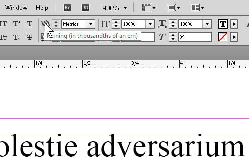
Not all programs have the ability to see and use, let alone adjust, the spaces between letters, but InDesign does. The two variations are “kerning” and “tracking”. The difference between them, basically, is whether you’re working with a pair of letters, or more than two. (The unit called an “em” is whatever the point size of the text, traditionally the width of the capital “M” in that typeface.)
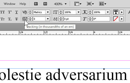
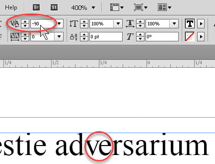
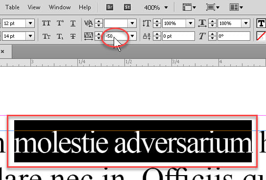
Working with InDesign, the kerning and tracking controls are about as simple as possible. Once you’ve got some text, select the letters/words you want to adjust, and click the Kerning or Tracking controls in the Control palette at top. Two letters can be kerned, more than two can be tracked. Remember that the adjustments are in very small increments, so if you’re experimenting with this for the first time, you may want to zoom in to see the effect a little quicker. As you may gather, negative numbers adjust letters closer together, and positive numbers further apart. If the number is zero for a selected pair or group, the adjustment is whatever the default says it should be.
Okay, cool. So why would we want to adjust kerning or tracking? Occasionally, we may need to squeeze a piece of text a tiny bit to fit it in a given space. Or stretch it a little to fill up a couple of lines’ worth of blank space on a page. This is not a cardinal sin in DTP, but we should treat it with the respect due, say, superhot tabasco sauce, or ghost peppers. A little goes a long way.
And one also has to remember that the human eye is a lot sharper than some people think. And if you go fiddling with the kerning and tracking throughout a document, it can stand out pretty quick. The density of the text can “show” at a subliminal level. No, I’m not kidding. And people will say “Look! They’re messing with the tracking!” Okay, maybe not, but one can see something isn’t quite consistent across however many pages. So treat with caution.
To learn more about this and many other useful items, try our InDesign classes.