How to Use Bitmap Mode in Photoshop
Adobe, Photoshop
Of all the image modes in Photoshop, perhaps the least used today is Bitmap mode. It’s the “true” black-and-white mode, unlike Grayscale, which is what a “black-and-white” photograph really is. And Bitmap actually has a couple of advantages, though making proper use of the mode does take a little understanding.
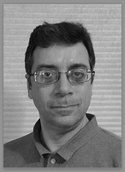
A color picture first has to be changed to Grayscale mode to drop color out, and then one can convert to Bitmap. (If the user knows the image is going to be put in Bitmap, it’s advisable to keep it fairly high-resolution; since Bitmap only has two colors—black and white—compensating with more pixels helps keep the image from looking too grainy.) There are a couple of other things one can do to make a grayscale image better, but that’s another story.
When Bitmap mode comes up, another dialog box asks a couple of questions. One is about resolution—usually we should not change this. If the image already has adequate detail, we leave it alone. Increasing the resolution should happen beforehand, if at all.
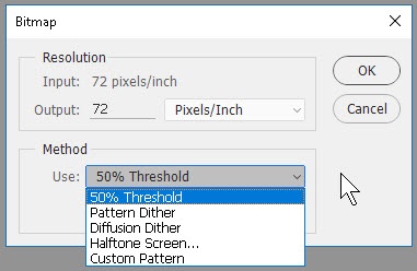
The other is “Method”—how should we handle the pixels? This is the real question, as it affects the final appearance the most.
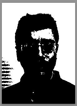
The first choice, 50% Threshold, looks at all the pixels in the image and applies a straightforward rule: If the brightness of the pixel is 128 or less, it turns black. If 129 or more (the possible range is from 0 to 255), it turns white. But this makes the picture look very harsh and blotchy, as it doesn’t take shading or grays into account.
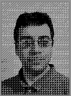
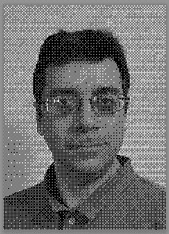
The next choice, Pattern Dither, sort of does this. It tries to distribute black and white pixels a little more evenly (in a pattern, hence the name), and can create a fairly “readable” image provided the resolution is not too low. Some people consider this to look artistic, and in some cases the image turns out pretty well.
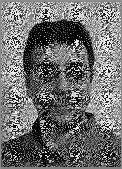
Diffusion Dither, though, is a better choice for a result which looks more realistic. “Diffusion” means the pixels scatter semi-randomly, the same way perfume gradually drifts through the air. The definition of “Dither” is “The use of dot patterns to approximate colors not available in the palette.” (Wiktionary)
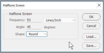
Halftone Screen is another matter, and produces something else again. Half-toning was used for a long time in producing newspaper photographs such that they looked like “true” grayscale images. What half-toning really does is to remake the image as a regularly-spaced pattern of dots of varying size to simulate grayscale, rather than bunching them together to make darker (or lighter, by spreading them apart) grays. How often this comes up today depends on what the print medium is going to be, but it’s not as useful for onscreen or conventional computer printing these days. Half-tone techniques exist partly to allow for rapid mass printing (newspapers, magazines) with relatively low-res, high-speed (therefore less expensive) processes.
The advantages to Bitmap mode are, first, it brings the file size WAY down, sometimes only a couple percent as big as the color version, or even less. (Only two colors, after all.) Ditto the grayscale version. Second, though it won’t have color, the detail and simulated gray shades can look almost as good as a true grayscale image, and take a lot less time to print. And finally, it’ll look decent on any printer, color or no. Picking the method is the only thing one usually has to worry about, and often the choice simply depends on the desired final use.
To learn more, take a look at our Photoshop training.