How to Use Color Libraries in Photoshop
Adobe, Photoshop
For some reason, a few people I’ve talked to seem a little uneasy about the Color Libraries. Either they don’t know what these are, or they don’t know how to use them. But they’re easy to bring into play, they’re very useful, and sometimes even necessary. They’re standard sets of colors anyone can use to make sure the viewer sees precisely the color they should.
Many companies have what are called “product branding” standards: Official fonts, official colors, logos, and so on. If I mention Coca-Cola, or John Deere, you can probably see the red or green in your mind’s eye. But if you were creating an ad for these (or other) companies, you’d have to match the color EXACTLY. It’s a copyright thing (the color plus the logo).
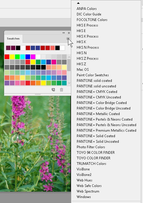
This is where the Libraries come in. Once you’ve created your basic art (and found out what the specifics are for the product branding colors), you can call up the correct library from the Swatches panel menu. (Usually, we append the choice of “book” to the existing palette.)
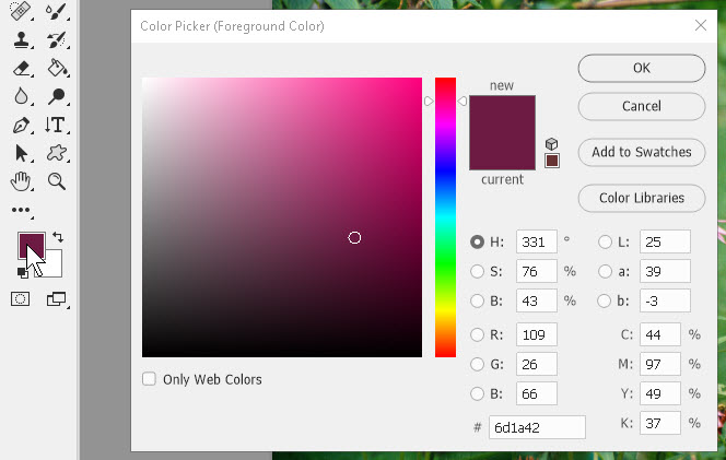
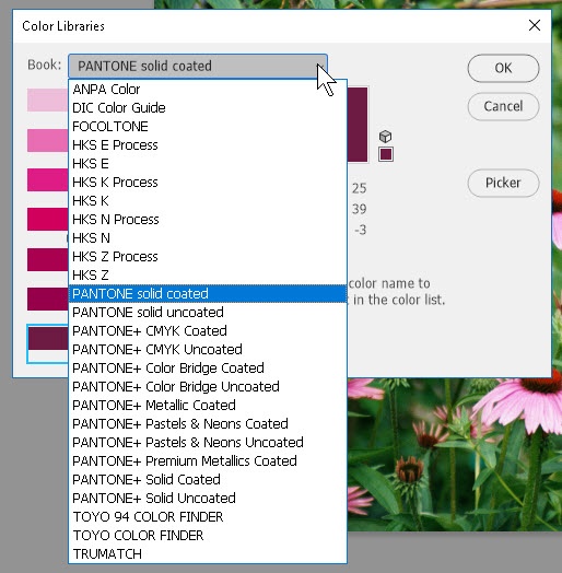
Another approach is to go through a color picker—say, for example, by clicking the foreground color swatch in the Tools panel. From the picker, you can click the Color Libraries button on the right. Then call up the appropriate book at the top, then the specific color. We add it to the swatches by clicking “OK”. It normally shows up at the top of the Swatches panel, properly named. Just hover on it.
The key to the technique is knowing in advance which of the libraries (or standards) the company, coworker, or whoever is using. Many companies will stick with a particular library or set of libraries to make things as simple as possible, and then all one has to do is check the type of paper or printing surface to use.
The color libraries are also the idea behind the concept of “spot color”. The plain-language definition of spot color is a color we DON’T mix from the C-M-Y-K inks, but in a separate cartridge, ready to go; it must match perfectly the desired color for (as I mentioned earlier) copyright purposes. It is normally not used everywhere in the document, only in certain spots, hence the name.
For more on this and other items, try our Photoshop classes.