Creating the Speedometer Gauge in QlikView
Business Intelligence, Business Objects, QlikView
QlikView, one of the big BI (business intelligence) programs you can get today, has a number of graphical ways to display data, which it calls charts. Among these, one of the coolest (sorry, but it is) would have to be the Gauge chart. And of the subtypes in that group, the speedometer style is probably one of the easiest to understand. For quantities, percentages, and a couple of other kinds of numbers, it’s very straightforward. Setting it up takes a little work, but it’s worth it for readability.
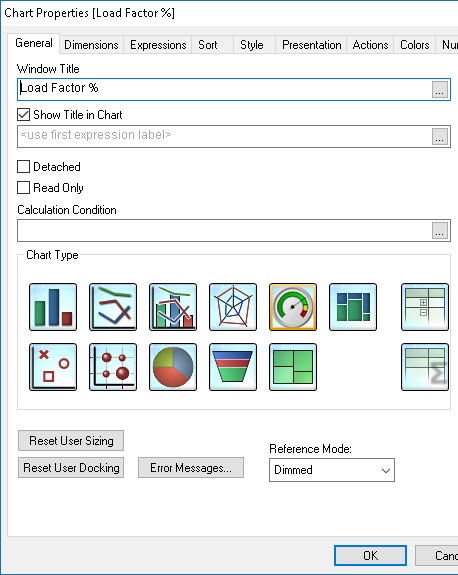
Once you’ve got your data ready (the scenario we use is an analysis of airline operations), the setup of the gauge starts with adding the chart object, specifying the type, and giving it a title, on the General tab.
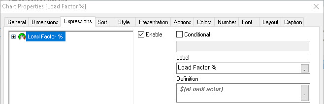
You also have to tell it where to get the data—that’s pretty easy. In this case, the Expressions tab includes the data source for the gauge as a variable ($(eLoadFactor)), but it’s just the number of passengers divided by the number of seats: Sum ([# Transported Passengers]) / Sum ([# Available Seats]).
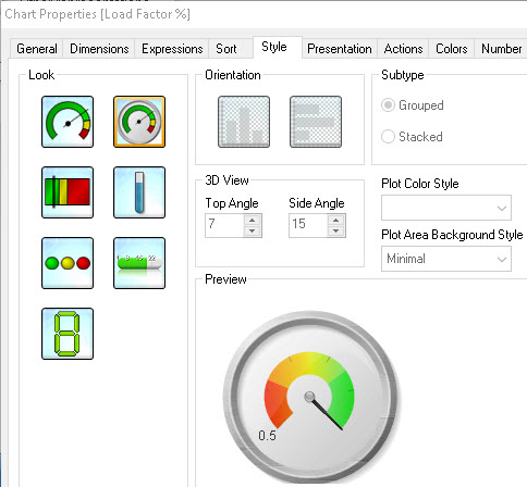
On the Style tab, you can select the exact kind of gauge you want. There are several, but I want to show you a few specific bits on the Speedometer.
The actual setup of the gauge is the part which takes the most work, but it’s essentially two or three questions to answer: [1] How do you want the colors to change, and how many should there be? [2] How many tick marks do you want on the gauge? (Think car speedometer or tachometer.) We do this on the Presentation tab; it’s usually where we have most of the work.
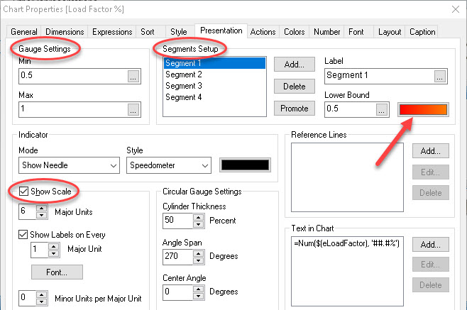
The Gauge Settings area on the left tells the program what the lowest and highest numbers will be. The Show Scale, below that, lets you specify how many tick marks are on the gauge, and how they should be marked off. The number of segments (Segments Setup) allows you to set how gradual the shading will be in the color area, and what colors you want.
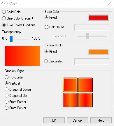
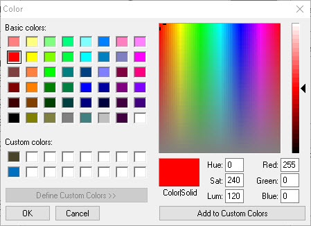
We usually set the colors with RGB numbers, since this allows smooth transitions with little work.
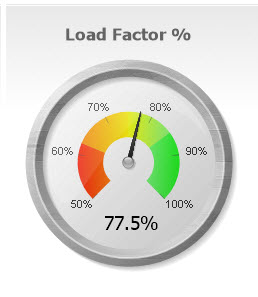
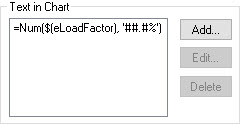
Finally, the Text in Chart area lets the Load Factor percentage show up numerically at the bottom of the gauge. The speedometer needle is fairly sharp, but having the actual number (to maybe one decimal place) in there is not too busy-looking and makes for a more accurate read with just a glance.
It takes a little practice to get the whole setup to work properly. But you can treat it like a recipe when you learn it, and just go step by step. A couple of run-throughs, and one can get the idea.
For more on this program, check out our QlikView training.