Skip to content
SkillForge
SkillForge
MENUMENU
  • Home
  • Courses
    • Adobe
      • Acrobat
      • Illustrator
      • InDesign
      • Photoshop
    • Business Skills
      • Communication Skills
      • Customer Service
      • Presentation Skills
      • Time Management
    • Crystal Reports
      • Introduction
      • Intermediate
    • Microsoft
      • Access
      • Copilot
      • Excel
      • Outlook
      • Office 365
      • Power Platform
      • PowerPoint
      • Project
      • SharePoint
      • Word
    • Web Development
      • Angular
      • HTML5 and CSS3
      • JavaScript
      • jQuery
      • PHP
      • Python
      • Vue.js
    • Microsoft Technical
      • Azure
      • Microsoft 365
      • PowerShell
      • Security
    • Tableau
      • Tableau Introduction
      • Tableau Intermediate
    • SQL
      • SQL Introduction
      • SQL Advanced
      • Introduction to SQL Databases
    • Project Management
      • Agile and Scrum
      • Project Management
  • About
    • About SkillForge
    • SkillForge Reviews – Student Testimonials
    • Our Clients
  • Contact
    • Contact Us
    • Careers

chart

Crystal Reports logo

How to Create a Basic Chart in Crystal Reports

In this Crystal Reports tutorial, we’ll learn how we can create a basic chart, so we can understand the numbers faster and see how business is going. Want to know more about this and other abilities in Crystal Reports? Check out our Crystal Reports training …

Read More

Categories Crystal Reports, SAP Crystal Reports
power-bi

How to Connect to a Data Source in Power BI

In this Power BI tutorial, you’ll see how to connect to basic data sources in order to start creating visualizations. The same technique applies to many kinds of data we use in the program, so the steps are pretty universal. Want to learn more about …

Read More

Categories Business Intelligence, Microsoft Office
power-bi

How to Create a Basic Visualization in Power BI

In this Power BI tutorial, you’ll see how to start creating visualizations (“visuals”, or “vizzes”) by selecting the type of display and the fields to go into it. You’ll also see a couple of the fine-tuning tricks to make a visual easier to understand. Want …

Read More

Categories Business Intelligence, Microsoft Office
Microsoft Excel logo

How to Create a Dual-Axis Chart in Microsoft Excel

Categories Microsoft Excel, Microsoft Office

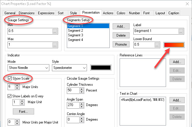
Creating the Speedometer Gauge in QlikView

QlikView, one of the big BI (business intelligence) programs you can get today, has a number of graphical ways to display data, which it calls charts. Among these, one of the coolest (sorry, but it is) would have to be the Gauge chart. And of …

Read More

Categories Business Intelligence, Business Objects, QlikView

Training Options

Live, Instructor-Led Online Training
Private Group Training
Self-paced eLearning
Blended Learning

About SkillForge

About Us
Student Testimonials
Our Clients
Privacy Policy
Contact Us

Courses

Adobe Training
Business Skills Training
Crystal Reports Training
Microsoft Training
Microsoft Technical Training
Project Management Training
Service Management Training
SQL Training
Tableau Training
Website Development Training

How To Articles

  • How to Create a User-Defined Function in Microsoft Excel
  • How to Set Up Multiple Columns with Section Breaks in Microsoft Word
  • How to Set Paragraph and Line Spacing in Microsoft Word
  • How to Use the Notes and Notes Master in Microsoft PowerPoint
  • How to Use the Print Titles Feature in Microsoft Excel
© SkillForge 2010-2025