How to Set Up Better Charts in Crystal Reports
Business Objects, Crystal Reports, SAP Crystal Reports
Crystal Reports is capable of inserting charts almost anywhere the user likes. The choice of type is nearly as wide as in Microsoft Excel. The main difference is, the chart has to be inserted before choosing type, layout specifics, and formatting. Though this can be a little daunting at first, it’s not really too different from the way other programs employ them.
One key element, generally, is to make sure the chart can be as self-sufficient as possible. As in programs like Excel, and rather unlike PowerPoint, a chart in Crystal has to be pretty self-sufficient, since we don’t know whether someone can email to ask questions about it. And mostly, users shouldn’t have to. So labeling, choice of type, and so on are always important.
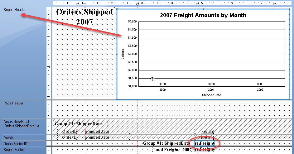
Another is, when inserting them, to make sure to select the field one wants to chart first. Crystal looks for this. It can actually go in any part of the report. But it’s usually best in a header or footer area, especially the report header. Putting a chart in the Details section of the report gets one for every record, and this is not frequently needed.
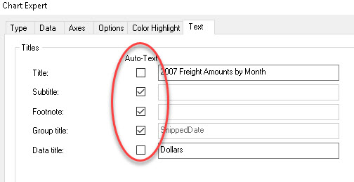
There are a few items which are usually necessities when building charts. Uncheck the Auto-Text checkbox in the Text tab of the Chart Expert, and possibly one or two others there. This can allow adding more meaningful titles. Making sure every element of the chart has a label is a good thing, as long as it isn’t cluttered with (seemingly) dozens of bits of text. Formatting the charts’ axes properly (showing dollar-sign formatting for sales numbers, for example) may seem obvious, but sometimes it’s so obvious we miss it.
And interestingly, some people mention that a legend is not always necessary, or even helpful. If the chart can have labeling which would make a legend redundant, one can easily uncheck Show Legend under the Options tab of the Chart Expert to remove it.
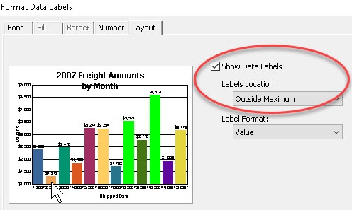
One apparently lesser-known trick is to format one element, such as the labels on columns or pie wedges. Left-click a single number-type label, then right-click it, and Format Data Labels to specify the labels’ locations or appearance.
The overarching point is to do a little planning on this in advance. What should we chart? Why? (Very important question.) Where should it go? And by implication, what level of data are we showing? The key thing is to make sure it clarifies the data, not to draw attention away from it.
For more on this, have a look at our Crystal Reports training.