QlikView – Dynamic Chart Titles

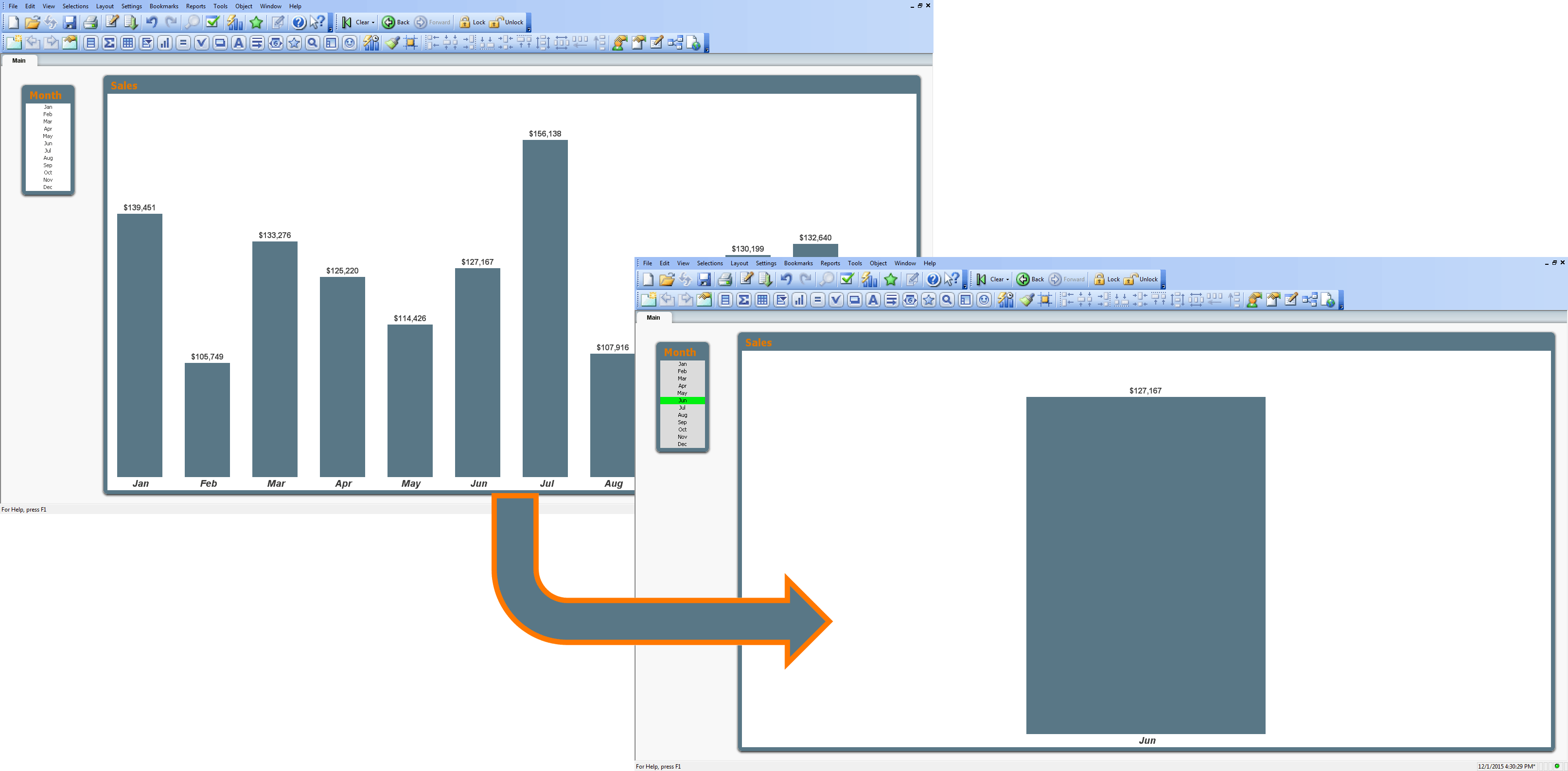
It’s every chart maker’s dream to have dynamically changing titles (well, that and a coffee table that looks like a giant floppy disk.  Seriously; Google that one if you haven’t seen it.  It’s pretty cool.)  Any-hoo…  To have a chart’s title change based on data you are, or are not, filtering by is a real boon to understanding the story that the chart is trying to tell.  Take the following example:QVDCT1

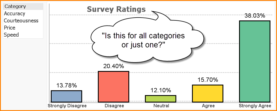
The reader of the chart can look at survey data for four categories all at once as a combined assessment, or they can filter by a specific category and evaluate the ratings individually.  If the chart were to be printed, the reader would not have much of an indication as to whether the chart was displaying all categories or focusing in on a single category.

Enter the DYNAMIC CHART TITLE!!!!!

Read More

QlikView – Always View Chart Bars

One of my pet peeves (wouldn’t that be a great name for a dog; “Peeve”?) when working with charts in QlikView is that I have a tendency to click on bars accidentally when showing data to colleagues.  When I do, all of the bars disappear except for the bar I mistakenly clicked on.  And for that millisecond in time, everyone receives a mental jolt that I wish would rather not have happened.

ChartBa

Since I was trying to direct their attention to a particular month, I think a better behavior would have been for the bar to change color to visually separate it from the herd.

I know what you’re thinking; “But how can a QlikView designer, like myself, enable such a behavior?”  I’m glad you asked.  Here’s the trick.

Read More