Cropping Images with CSS

There are times when you want to focus on a specific area of a photograph but don’t need a separate, cropped version of the picture. CSS offers an approach that will maintain the complete, original image but allow you to crop, mask, or clip your picture.

Let’s begin with a simple example. This page includes a full-size image of a young lady sipping a cold beverage on a beautiful spring day.

Read More

Using CSS3 Instead of JavaScript

CSS3 has been in development since 1998, that’s right, 1998. Both CSS1 and CSS2 became standards in quick succession, December of 1996 for CSS1, and May of 1998 for CSS2. One of the main differences between CSS3 and its predecessors is the use of documents or “modules” to contain different components of the specification. Some examples would include media queries, level 3 selectors, level 3 color, and multi-column layout. These modules progress at different rates and are largely dependent on browser support.

Read More

Preserving White Space Using CSS

We find it easy working with white space in today’s generation of applications. In word processing pressing the spacebar, tab key, enter, return, or even shift+ enter and what they deliver are all things we have grown to expect. That isn’t the case when designing …

Read More

How to Size Fonts in CSS

One consideration most designers go through when creating content for today’s web is; should my stylesheet begin with a reset? The variety of reset options used today is fodder for a completely different discussion, but there is a subtopic I’d like to pursue. Oftentimes a …

Read More

Typography: Part 3

In Part 1 we began with a simple classification of the different typefaces used today.

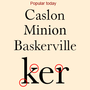
In Part 2 we took a simple look at some of the basic character components.

In Part 3 we want to make the users of Adobe products aware of a wonderful service that is available through the Creative Cloud.

Back in 2009 Jeff Veen, Bryan Mason, Ryan Carver, and Greg Veen, all originally part of the Measure Map/Google Analytics team began a company called Small Batch, Inc. Its purpose was to make font usage on the web far more accessible by introducing a product called Typekit.

Designers had been painfully aware of the limitations associated with font usage online since the webs beginning. At best there were about 14 fonts most designers could count on being installed on the average user’s computer. Did you think everyone was really that crazy about Times New Roman, Arial, or Verdana?

Read More

How To Plan a WordPress Website

wordpress-logo-stacked-rgbYou’ve decided you need a website for your business, your frequent family reunions, your… And YOU want to build it – you don’t want to pay someone. Where do you start? Here’s the frustration and fun. You search  “how to build a website” (or something similar) and the resulting possibilities are seemingly endless. Wow. Where’s the aspirin?

Read More

Typography: Part 2

In Part 1 we began with a simple classification of the different typefaces used today. We kept things simple and broke them down into 5 different groups; serif, sans-serif, monospace, handwritten, and decorative. In Part 2 we will take a simple look at some of …

Read More

Typography: Part 1

This will be our initial look into the world of text. All those letters that we string together to form books, online articles, blog posts, and the like.

Most mere mortals pay little attention to the how and why of assembling all those words into a form worthy of consumption.

“Typography is to literature as musical performance is to composition: an essential act of interpretation, full of endless opportunities for insight or obtuseness.” ― Robert Bringhurst, The Elements of Typographic Style

This series will begin with a simple classification of the different typefaces used today. To keep things simple I, and many others, have chosen to break them down into 5 different groups; serif, sans-serif, monospace, handwritten, and decorative.

serif_fonts

Serif

Read More